Free
Four-column footer with CSS Flexbox

Hunter Becton
HTML
CSS
Parcel
100
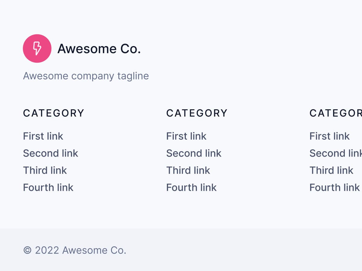
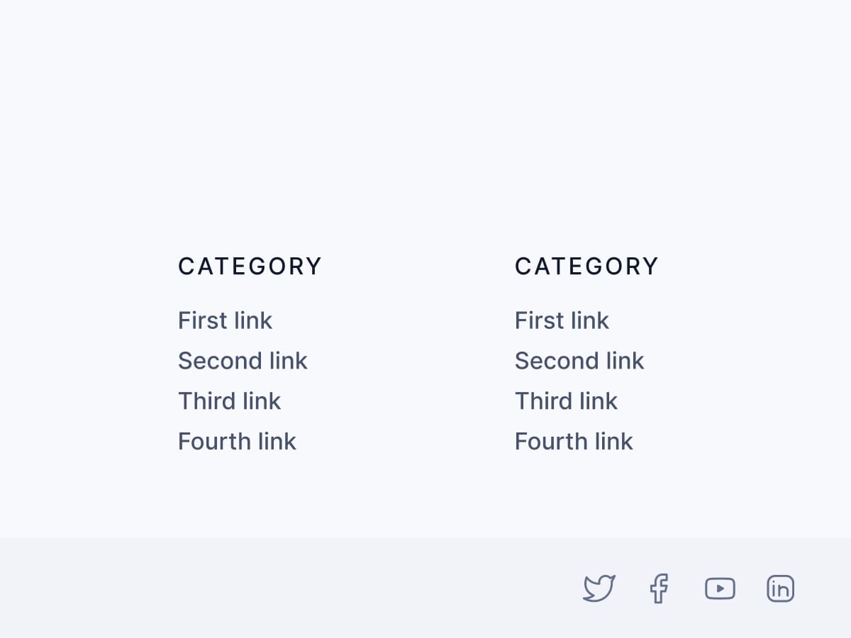
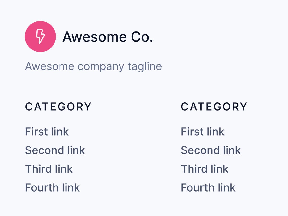
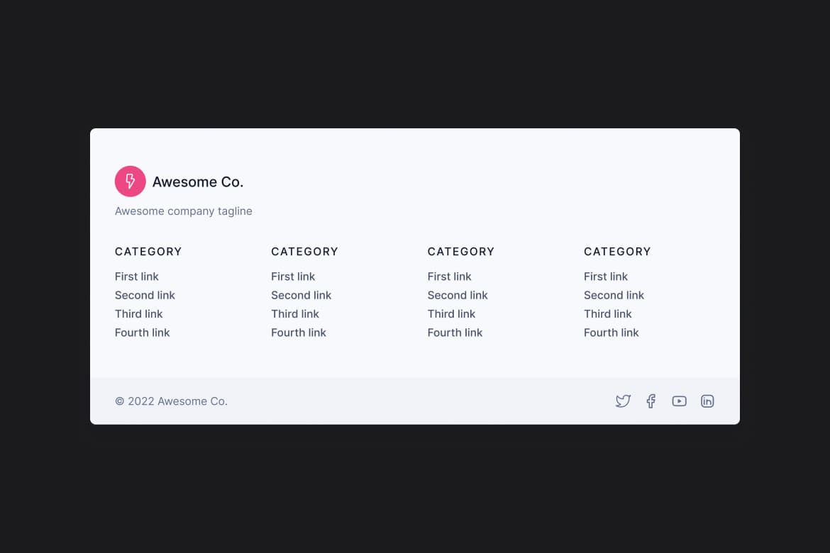
Multi-column footers are a common design across marketing websites because it's an easy way to organize important links into categories.
Level 1
Your Challenge is to create a responsive, four-column footer. This type of footer is common across marketing sites because it efficiently organizes essential links into related categories.
Your Challenge is complete when:
The footer is as close to the original design as possible
The footer is responsive and viewable on multiple screen sizes
Elements have the correct state styles (hover, focus, etc.)